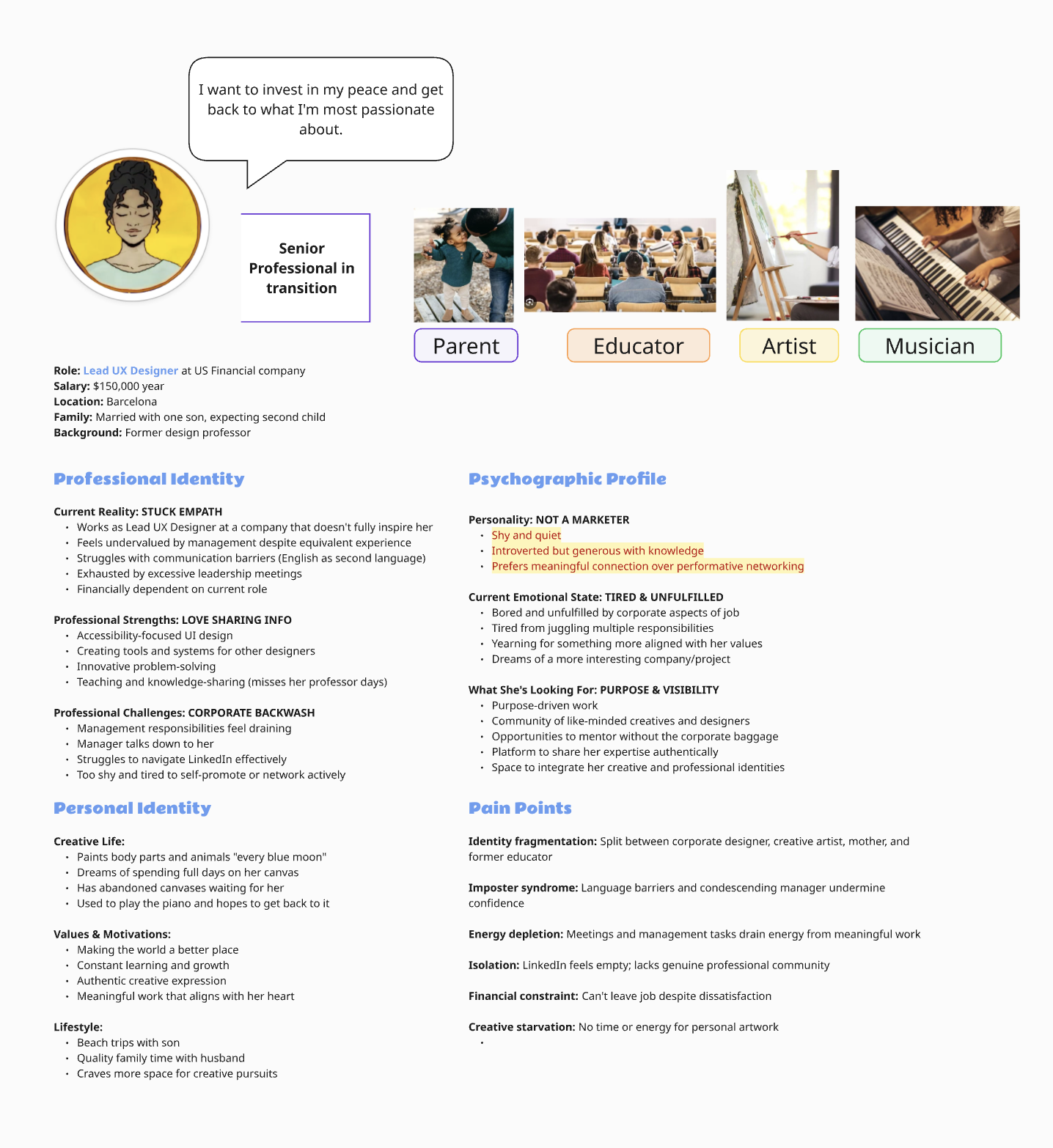
I co-founded and designed SWURL — a networking platform built for professionals who are tired of performative self-promotion and want real mentorship, honest feedback, and cross-industry connection. I led the product vision, research, branding, UX design, and go-to-market strategy, taking the platform from an idea to a live product with an active community and two Kickstarter campaigns.

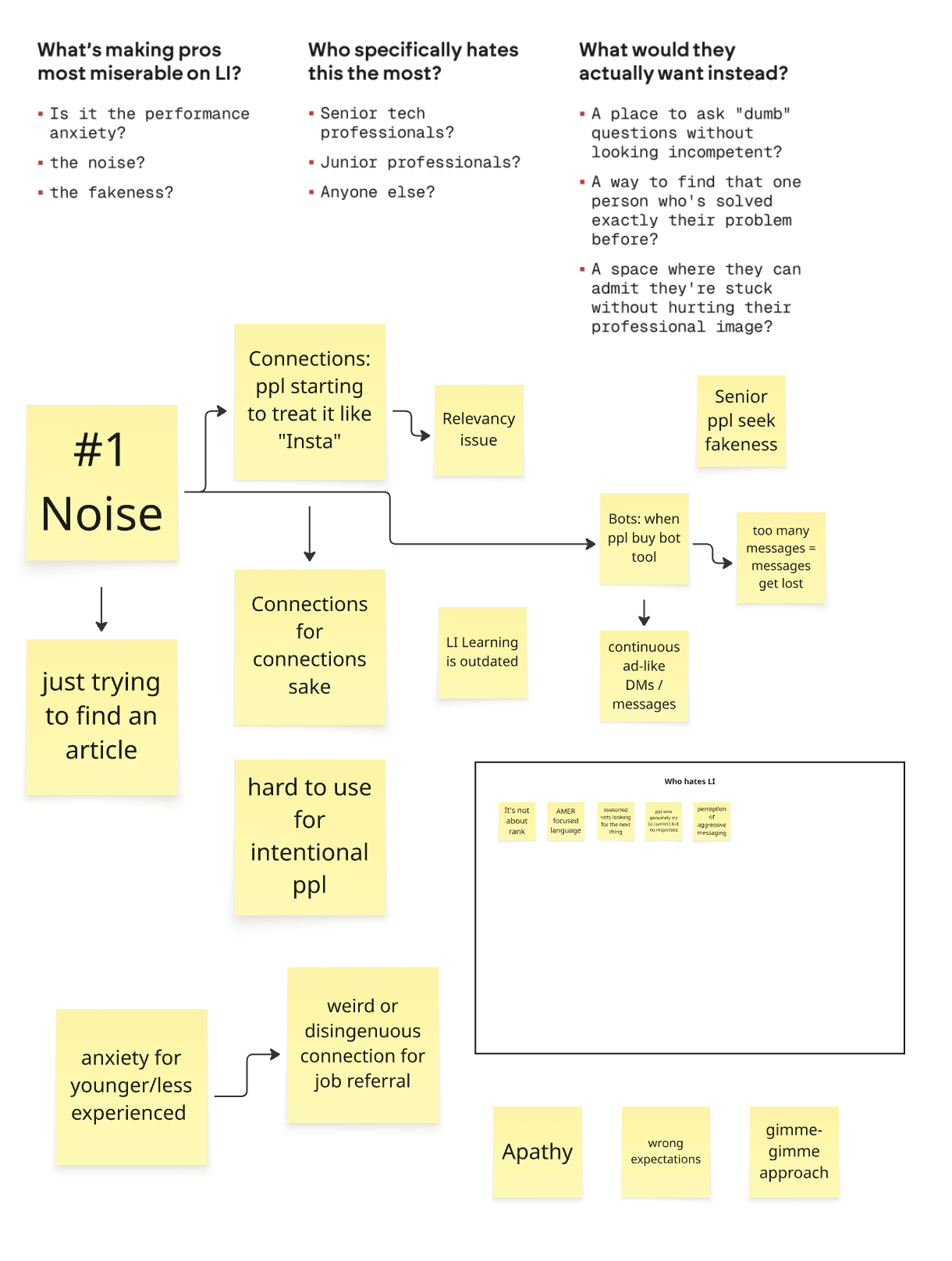
We conducted user research with 100+ professionals across creative fields, business, and technology to understand how they currently seek mentorship and what was missing.
Key findings:
- Most professionals rely on informal networks (friends, former colleagues) for career advice — not platforms
- People described LinkedIn as "exhausting" and "performative" — they felt pressure to market themselves rather than learn
- The most valued mentorship moments happened across disciplines, not within them — a designer learning negotiation from a consultant, an artist learning business planning from a founder
- Trust was the biggest barrier — people didn't want to be vulnerable with strangers on a public platform
The product needed to feel like a private community, not a marketplace. Connection should be based on values and growth goals, not job titles.

1. No marketing, no performance.
SWURL would have no follower counts, no content algorithms, no pressure to "build your brand." The platform would reward showing up authentically — sharing your creative self, your questions, and your real work.
2. Cross-industry by design.
The matching system would intentionally connect people from different fields. Your mentor wouldn't be someone who does what you do — they'd be someone who sees the world differently and can offer perspective you can't get from your peers.
3. Depth over scale.
Rather than optimizing for user volume, we'd optimize for quality of connection. Features like goal-tracking dashboards, portfolio and resume feedback from handpicked experts, and structured conversation prompts would make each interaction count.
Information Architecture & User Flows
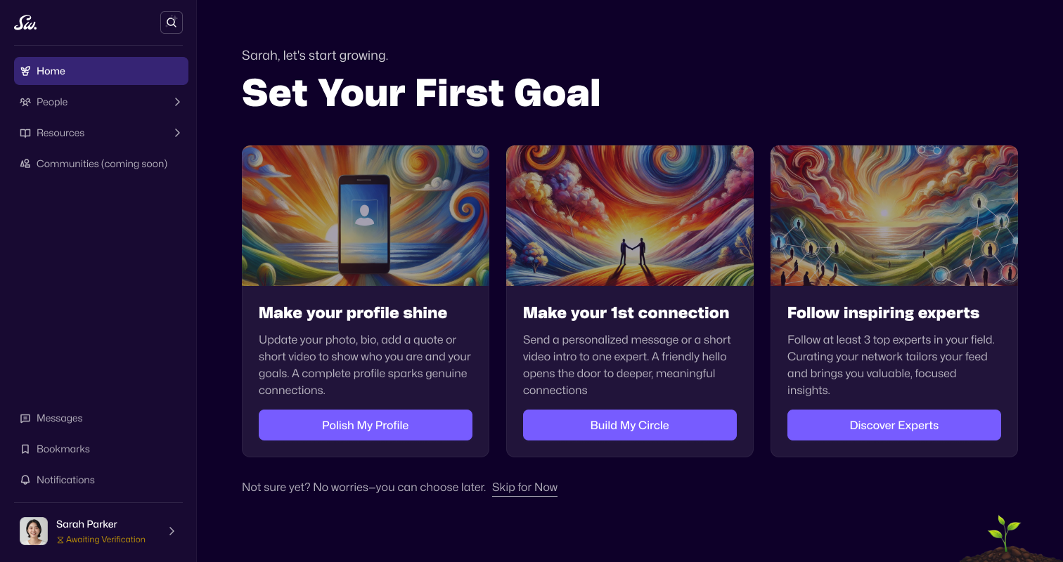
I mapped the end-to-end experience: onboarding (how do we learn enough about someone to match them well without making the process feel like a job application?), discovery (how do people browse potential mentors by values and interests rather than titles?), and ongoing engagement (how do we keep people coming back after the first conversation?).
Wireframing & Prototyping
I created low-fidelity wireframes in Figma to test core flows with users, focusing on the moments that mattered most: the first impression of a mentor's profile, the experience of requesting a connection, and the post-conversation follow-up. I built interactive prototypes to communicate the vision to our development team and potential backers.
Branding & Visual Identity
I designed SWURL's complete brand identity — logo, color palette, typography, and visual language. The brand needed to feel warm and approachable without looking "corporate wellness." I wanted it to signal: this is a serious place for growth, but it's also a place where your full creative self is welcome.
Usability Testing & Iteration
I ran usability testing sessions throughout the process, iterating on:
Onboarding flow: simplified from a single long form to a multi-step progressive profile that reveals mentors before you finish (based on feedback that users wanted to see value before investing time)
Mentor profiles: shifted from résumé-style layouts to profiles that highlight values, creative interests, and "how I can help" statements
Goal-tracking dashboard: refined to be simple and motivating rather than overwhelming


The choices that defined the product:
Profiles show your full creative self, not just your job title.
Users can share favorite books, personal projects, creative influences — the things that make connection human.
This was a direct response to research showing that the best mentorship relationships start with shared values, not shared job functions.
Matching across industries, not within them.
The platform's recommendation system deliberately surfaces people from different fields. This was SWURL's core differentiator and the riskiest design bet — we were betting that people would be open to mentorship from outside their domain.
Expert-led feedback, not crowd-sourced opinions.
Portfolio and résumé reviews come from handpicked specialists, not open forums. This addressed the trust barrier from our research — people were willing to be vulnerable if they knew the feedback came from someone qualified.
We created a series of co-design sessions with our target users. Our goal was to understand what would motivate them to use our platform now. What were the minimum requirements for a useful MVP?


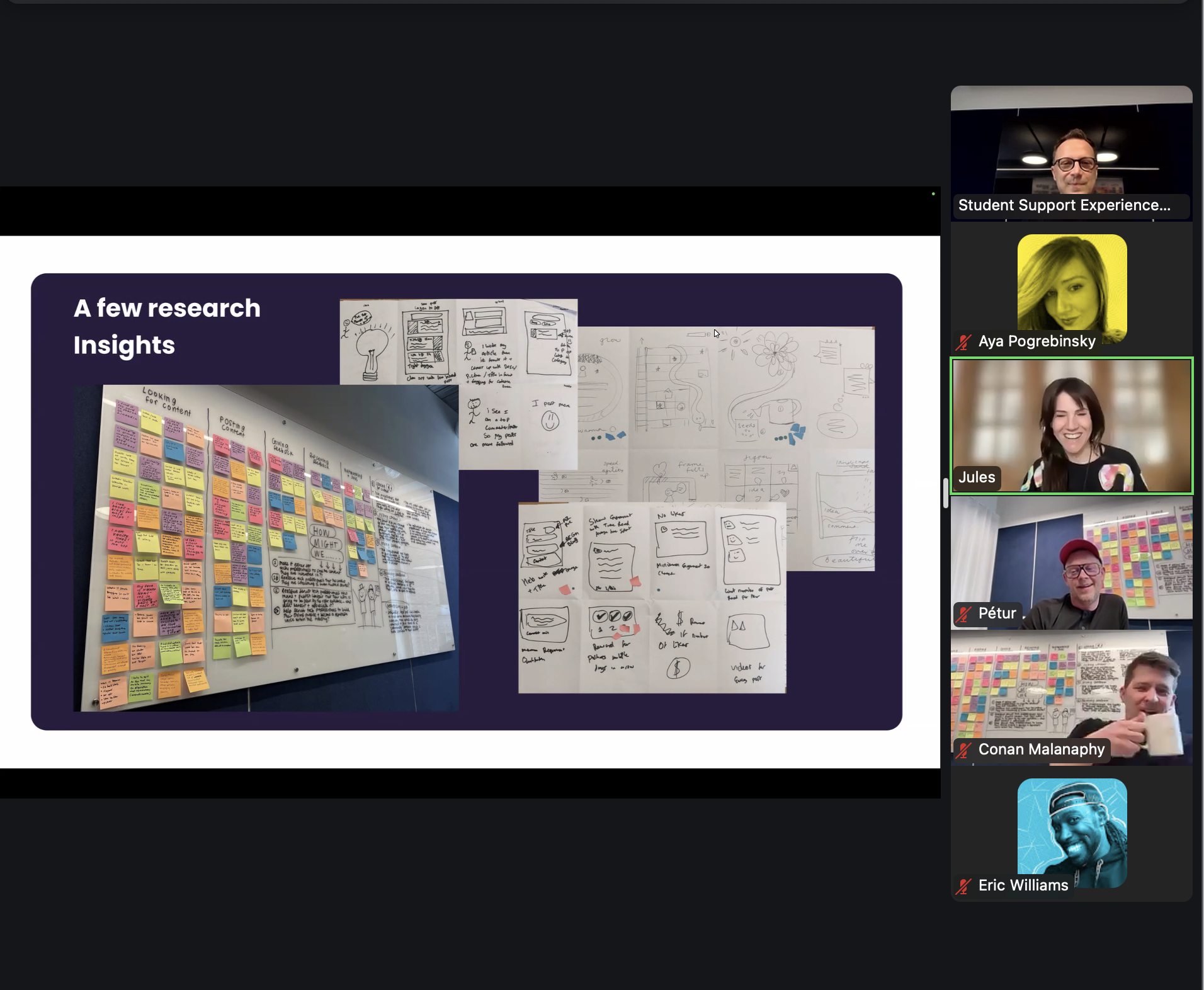

We began by mapping our core user's journey - from their first interaction with the platform through their evolution into becoming mentors themselves. Through collaborative design sessions in Figma, we identified four essential components: a personalized dashboard to track progress, an interface for mentor-mentee interactions, a space for creative portfolio sharing, and a curated inspiration feed. This structure emerged from carefully mapping each touchpoint in the user's growth journey.

Our iterative design phase spanned two months, with continuous user validation of our hypotheses. I led a collaborative design team including a senior and junior UX designer, while working closely with our researcher who gathered survey data to inform our decisions. I took an active role in both hands-on design work and design leadership, providing detailed feedback and critiques while also contributing directly to the design solutions. This balanced approach helped us maintain consistency and quality across all our iterations.
As we defined our MVP, I developed a parallel track execution plan for design, development, and testing. The challenge was coordinating a talented but part-time team. To maintain momentum, I took on initial design work while bringing in an exceptional UX designer and brand designer to elevate the product's quality. While my early designs served as foundational wireframes, I knew bringing in top design talent would be crucial for creating a truly compelling product.


We took a strategic approach to building our MVP, aiming to validate and refine as much as possible before seeking funding. This phase proved particularly challenging as we balanced speed with quality - each design decision carried more weight knowing it would soon move into development. Unlike the flexibility of Figma where iterations are seamless, development changes would require significant resources. This reality pushed us to be more thorough in our design decisions, validating each feature carefully before committing it to code.
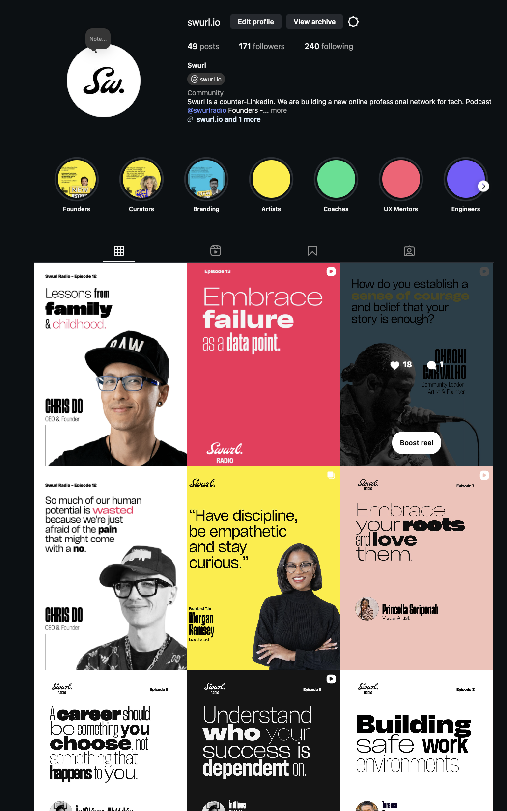
The goal was to communicate to our audience about what we are doing and at the same time showcasing talented individuals within our network.
I initially hired a strategist and we talked through our goals and mission. I was very much inspired by Chris Do's talk about personal brand. So we worked on a social media that had a storytelling element.
The biggest challenge with this part of the project was finding the motivation to post constantly and also finding the right designer to execute the look and feel I was looking for. I missed the mark and brought a freelancer in who didn't completely know how to mirror the brand, so I ended up going to the original brand designer and hiring him to create our social media assets. It was a more expensive decision, but it was worthwhile because now I have a great template to use moving forward.

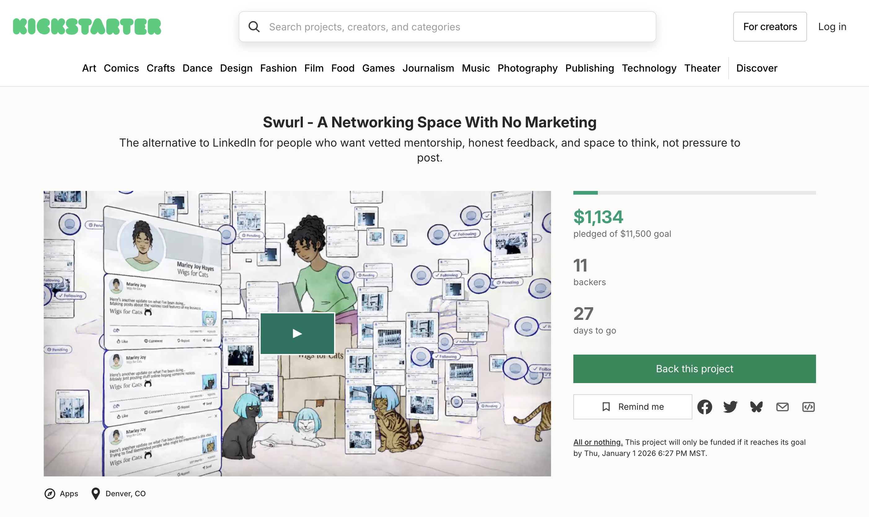

I led two Kickstarter campaigns to validate demand and build early community. This required a different kind of design thinking — translating a product vision into a compelling narrative for people who'd never used it.
I designed the campaign pages, produced the Kickstarter video, and crafted the messaging strategy. The positioning — "The alternative to LinkedIn for people who want vetted mentorship, honest feedback, and space to think, not pressure to post" — came directly from user research language.
Beyond Kickstarter, I launched Swurl Radio, a weekly podcast featuring conversations with creative professionals, coaches, and entrepreneurs. The podcast served as both community-building and ongoing user research — every episode gave me new insight into what our target audience was struggling with and what they needed from the platform.